Date:
January 18, 2023
Role:
UX Designer, UX Researcher
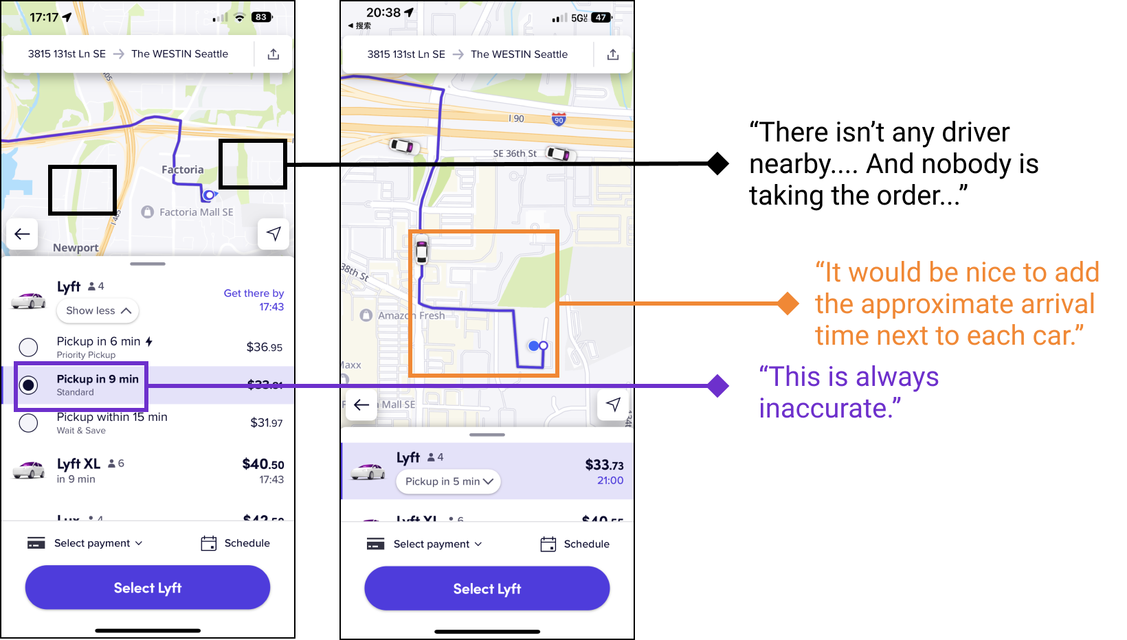
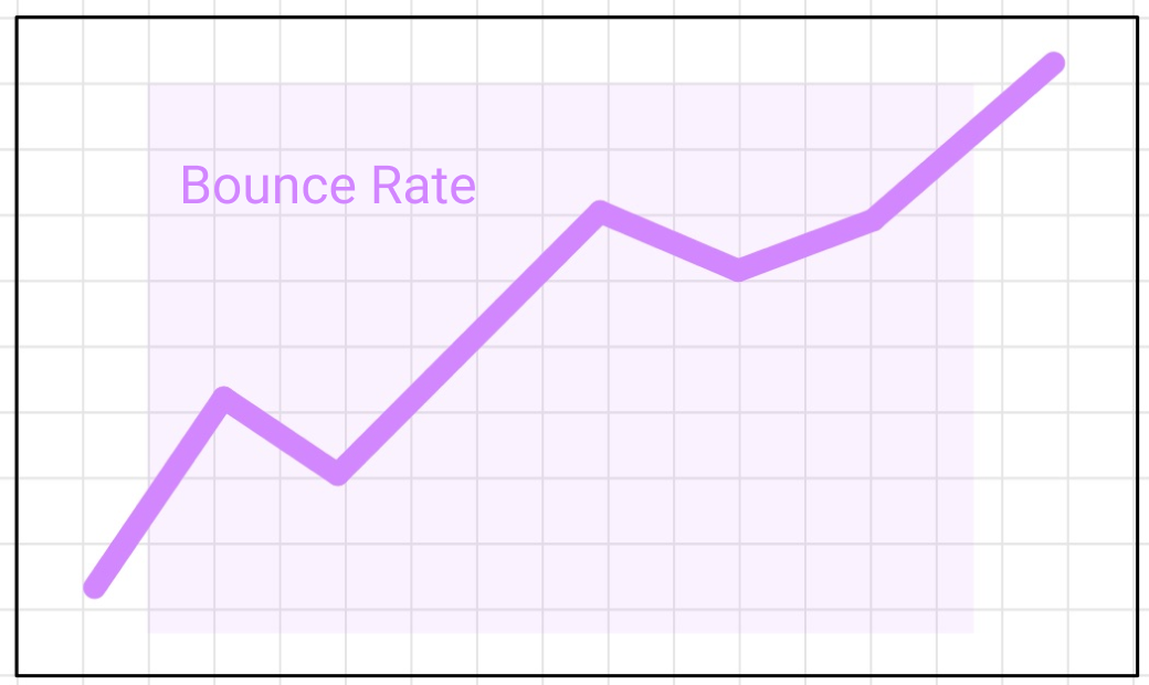
The Lyft App’s bounce rate had increased by 4.8% in the past quarter from October to December 2022 and the active riders decreased 45.41% compared to 2019. To reduce the bounce rate and increase the number of active riders, I come up with solutions that can improve the experience during user waiting for their ride.

Lyft faces increased bounce rates (4.8% this quarter) and a significant YoY drop in active riders (down 45%), indicating user dissatisfaction, particularly in the ride request flow. To address this, improvements like status updates and countdowns are essential to enhance user experience and prevent rider defections.

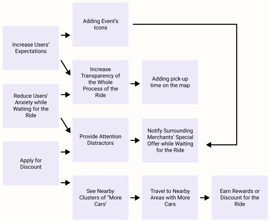
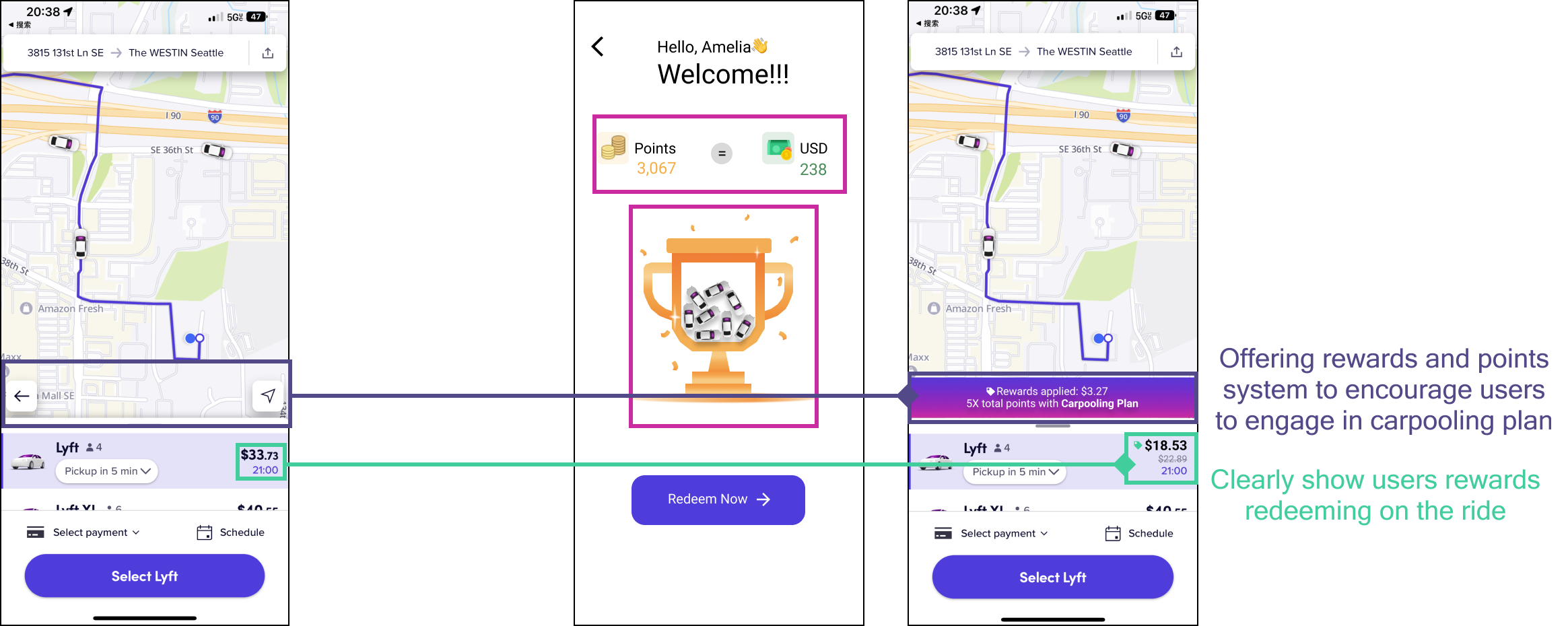
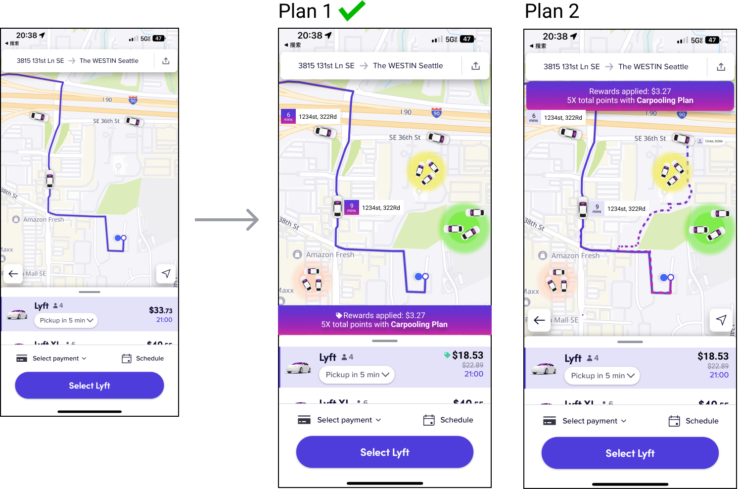
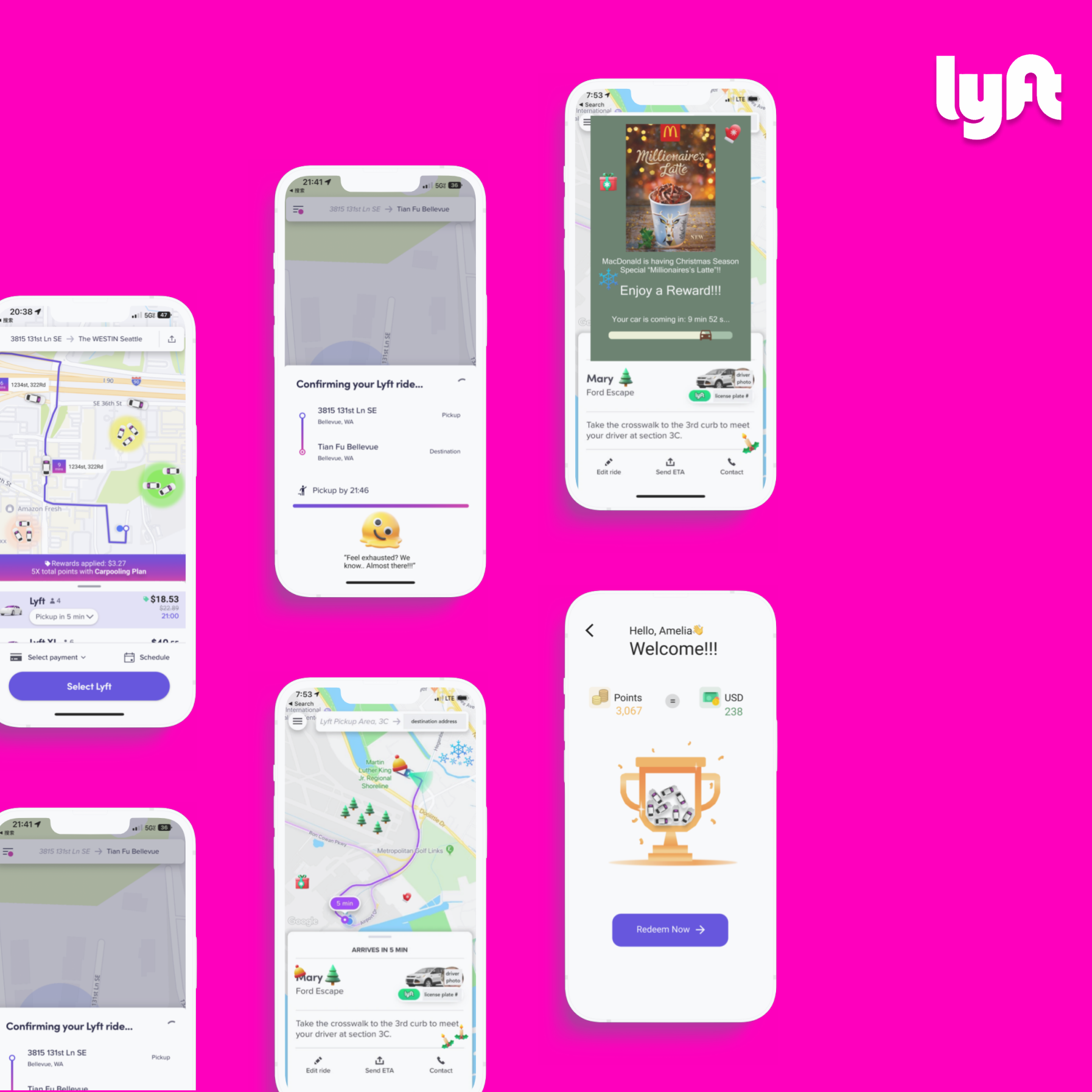
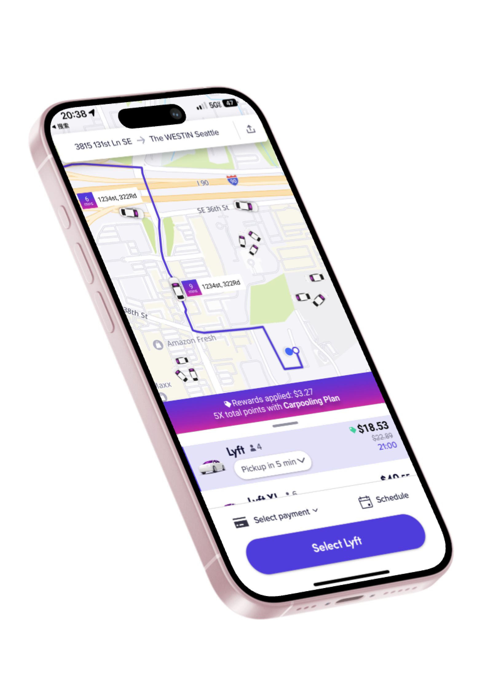
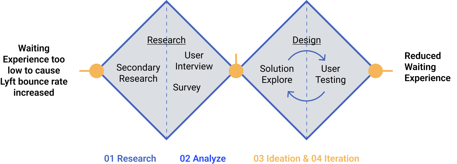
To tackle Lyft's high rider defections stemming from ride request drop-offs, I'm adopting a three pronged solution involving setting proper wait time expectations through arrival transparency, incentivizing movement to faster pick up zones via map heat-mapping and loyalty rewards, and cooperating with nearby merchants on in-app deals that divert and entertain users during the otherwise dull waiting phase.
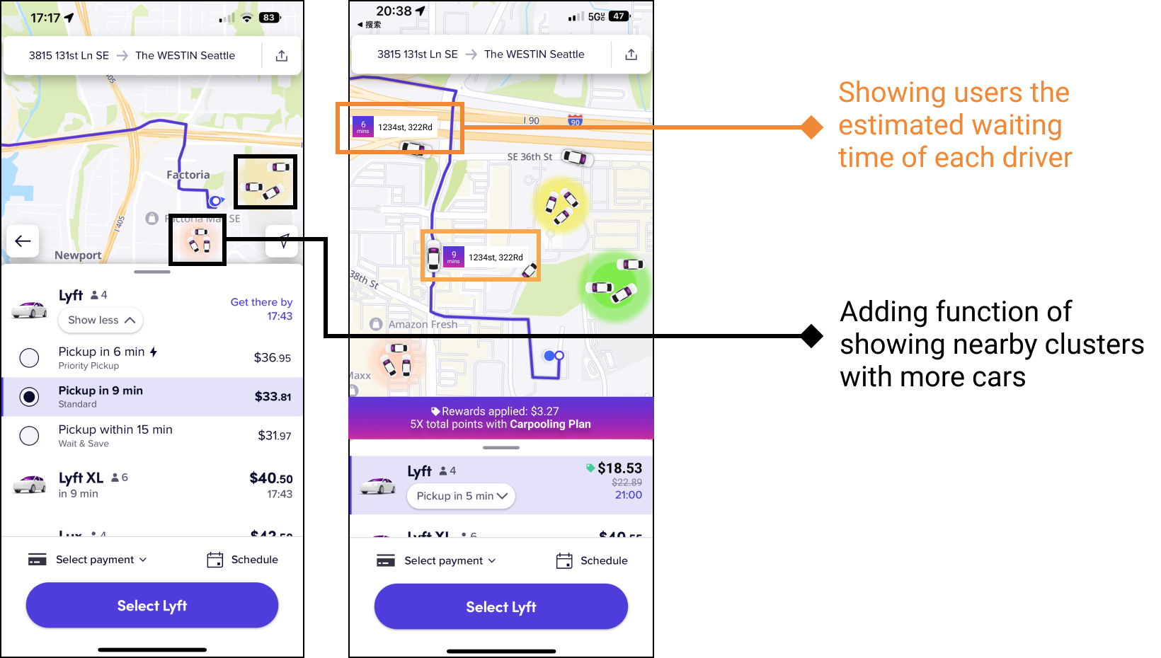
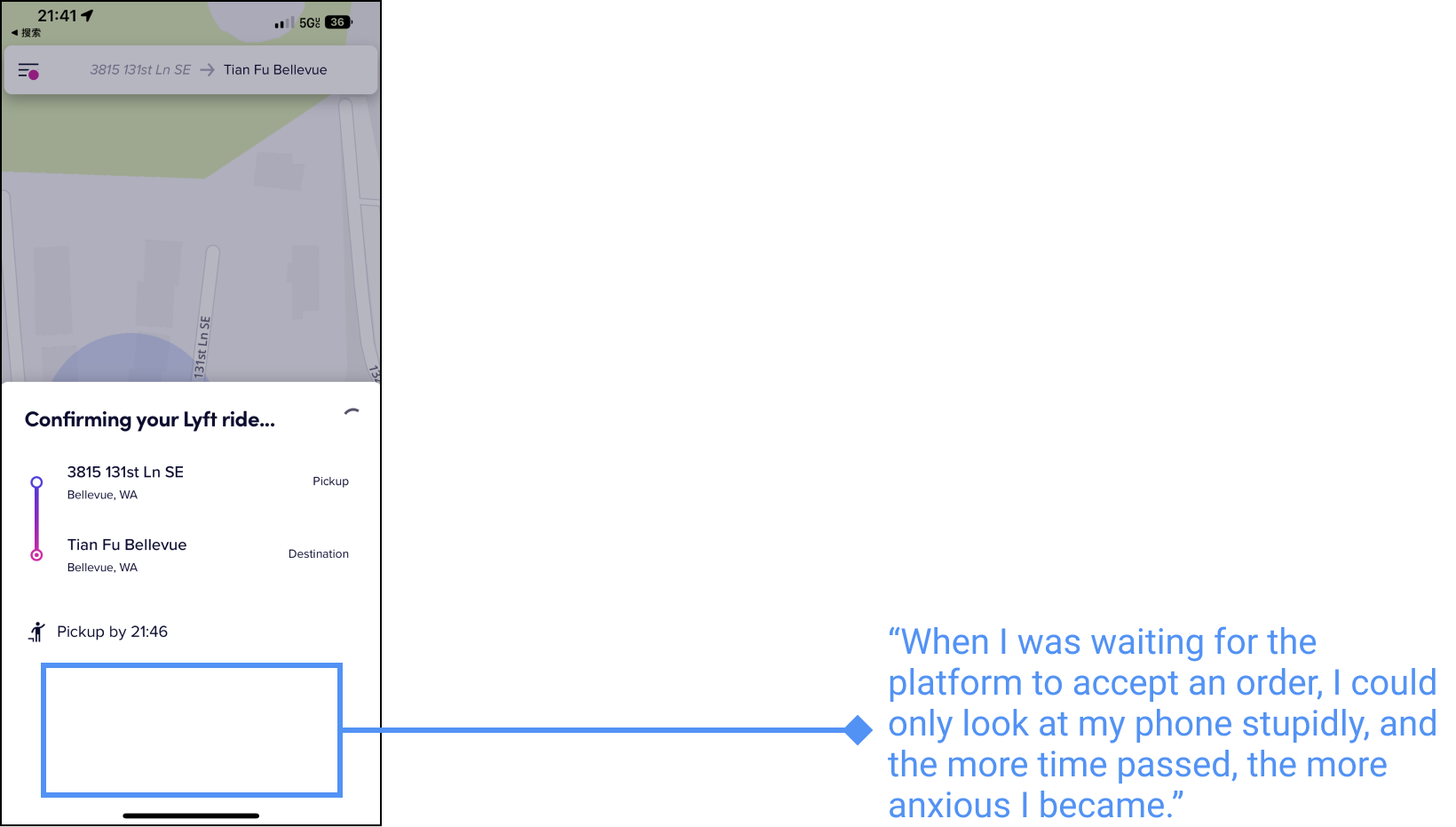
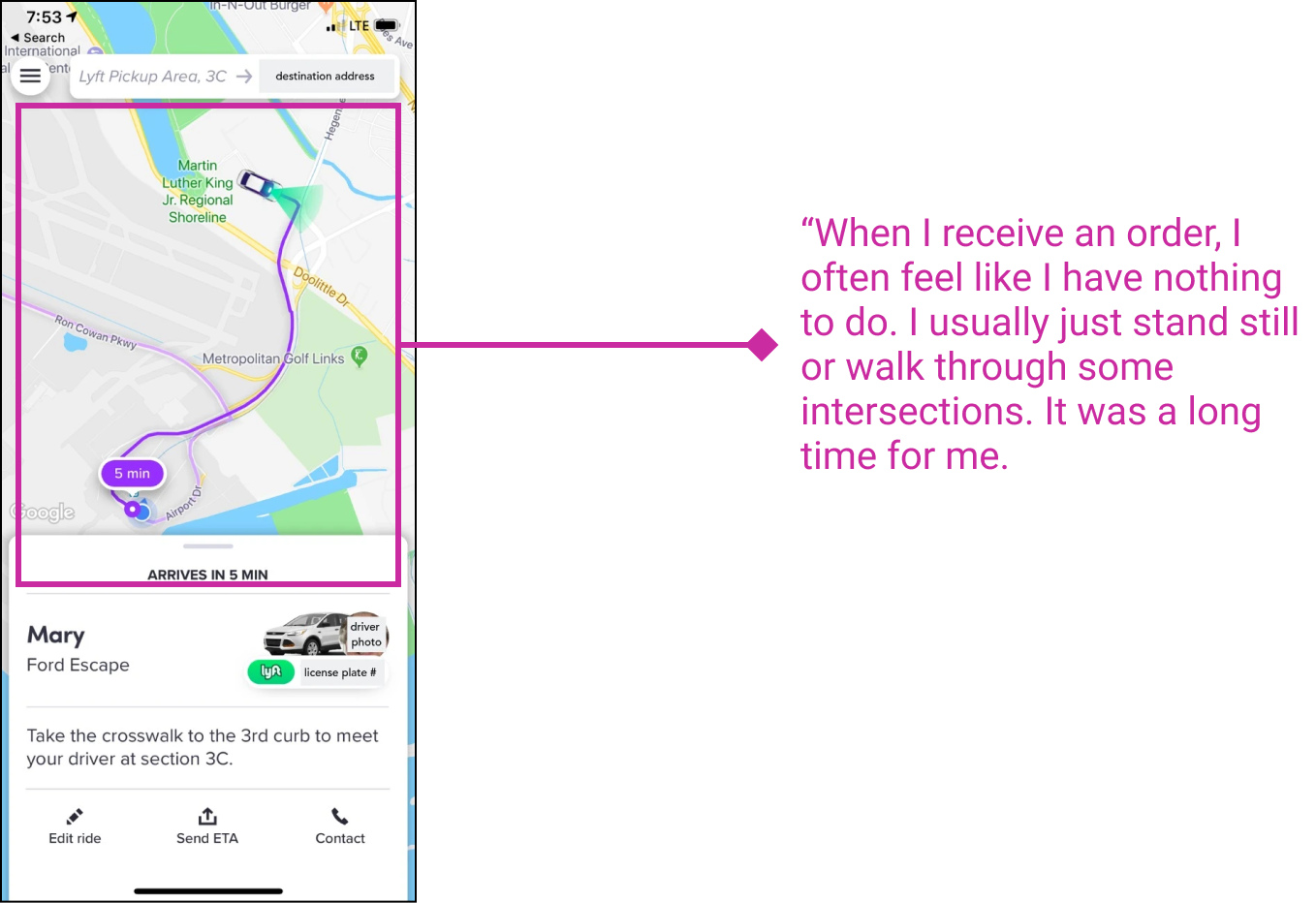
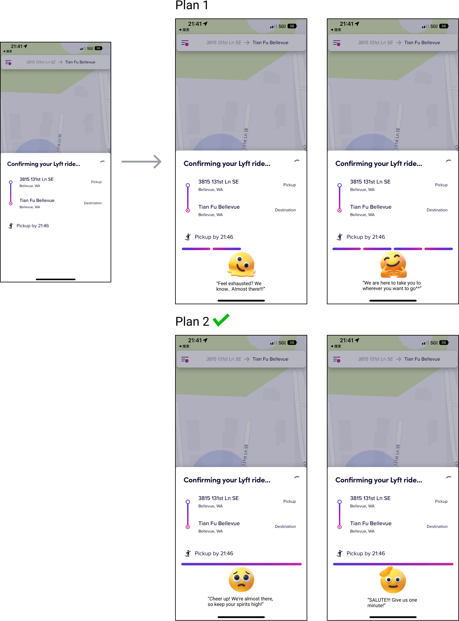
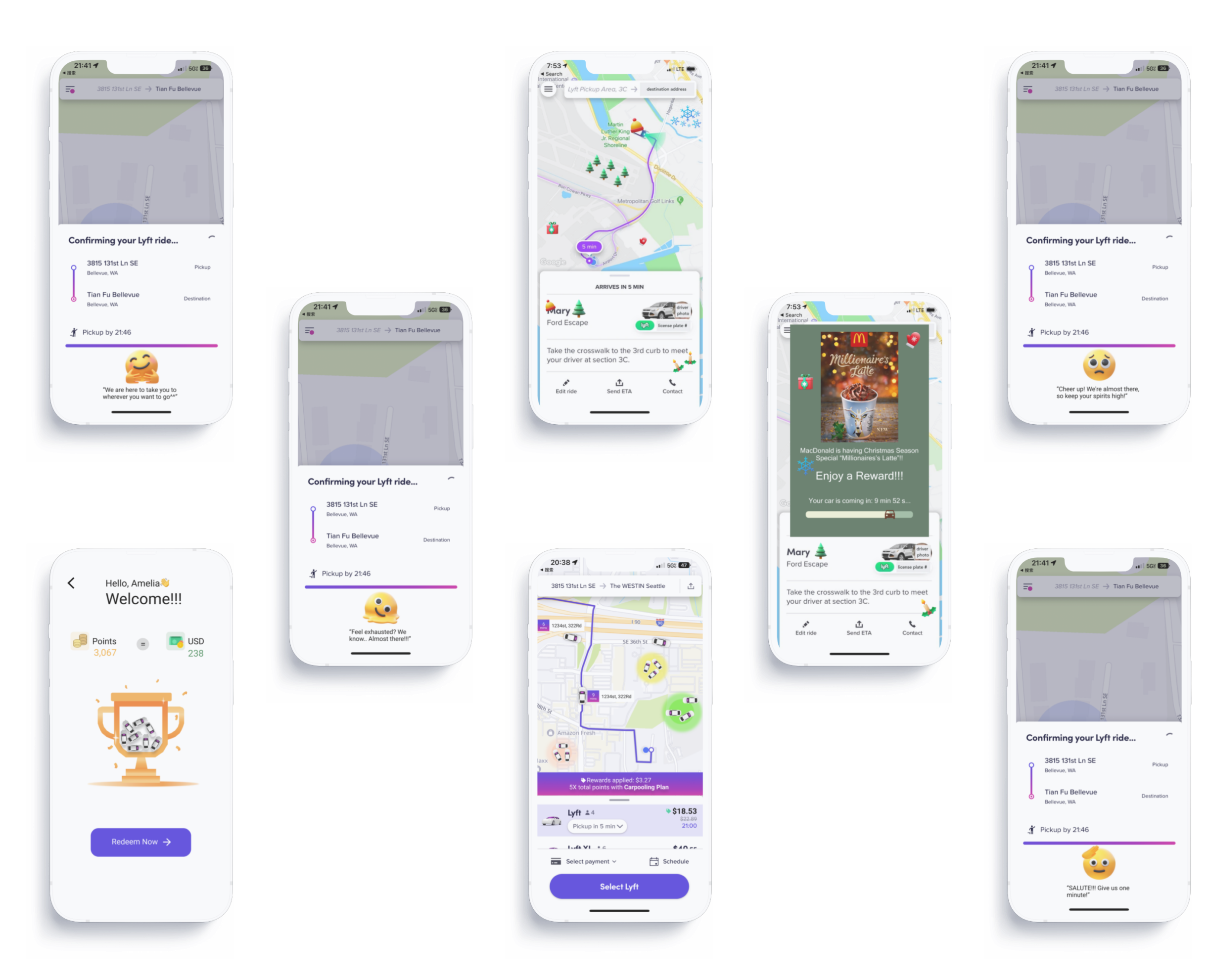
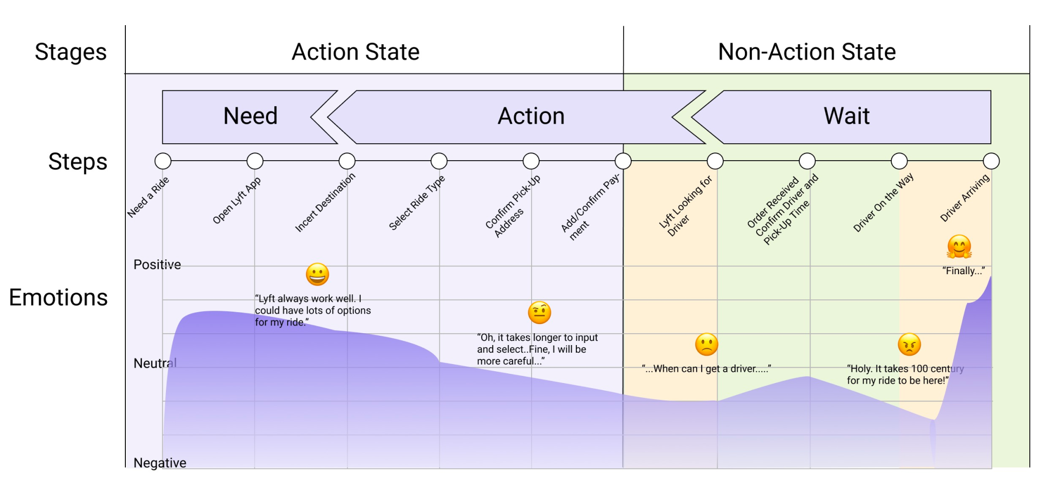
Reduce user anxiety while waiting for a ride by increasing the transparency of the arrival process.
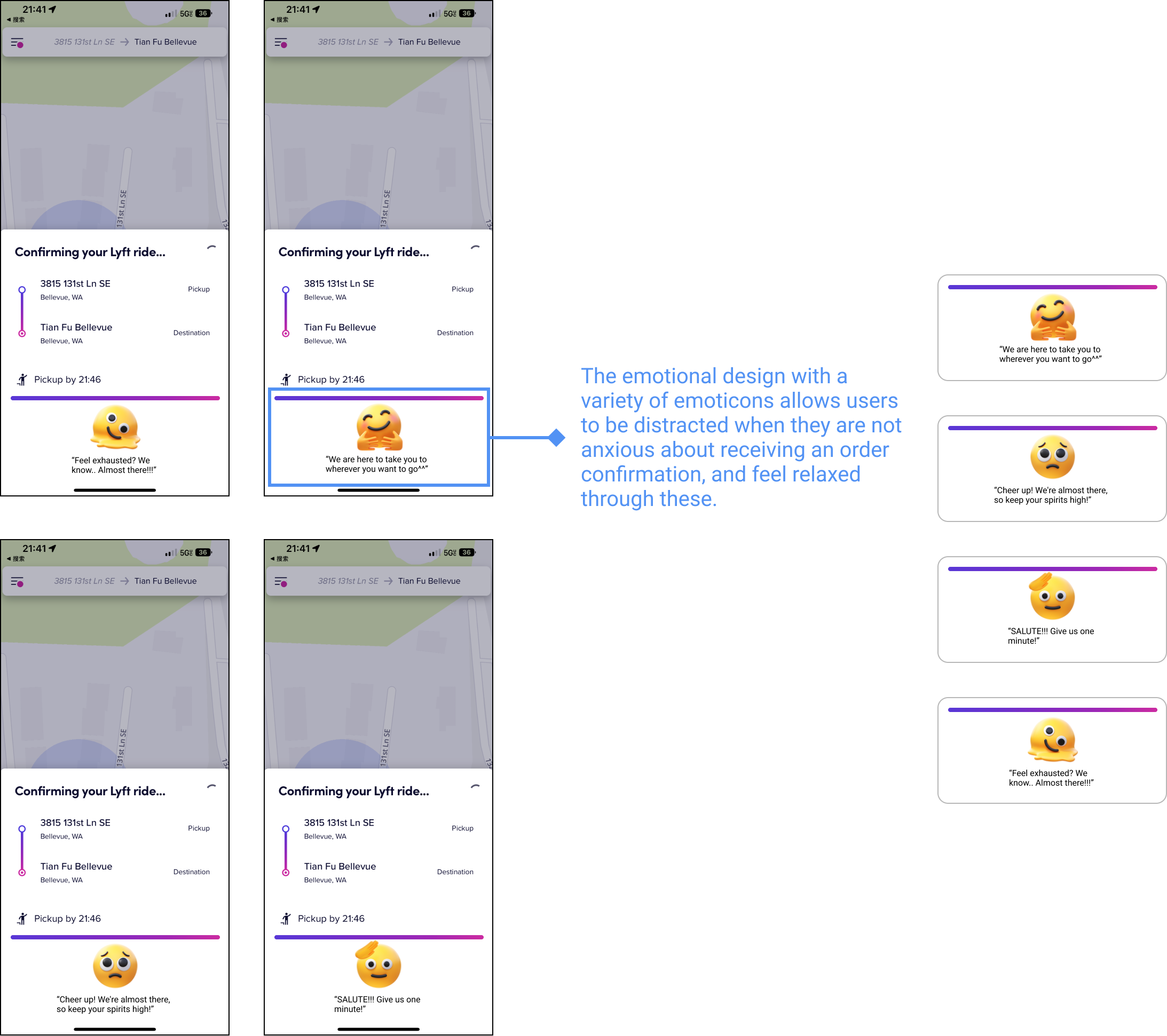
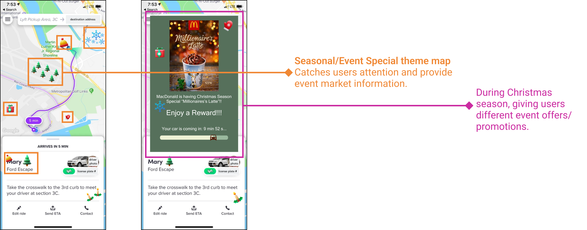
Cooperate with merchants to launch discounts from surrounding merchants and seasonal special offers while users are waiting for the car to help users distract and reduce anxiety.
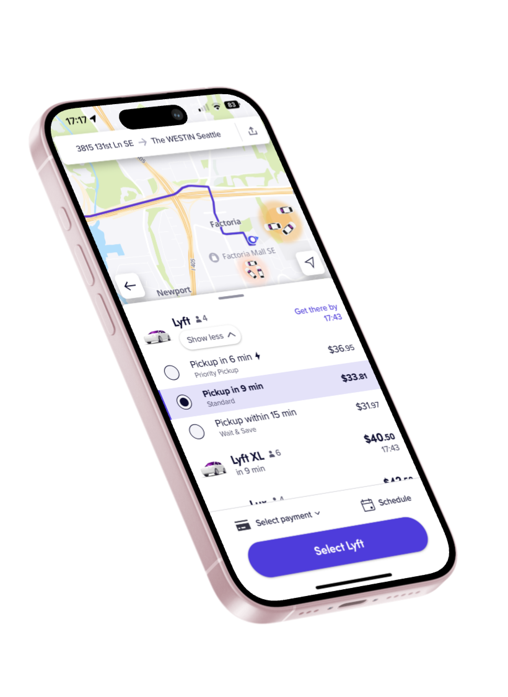
Encourage users to go to areas with more cars by coloring and clearly showing them the nearby areas. Also giving loyalty rewards that can give users who are willing to travel to areas with more cars by offering points and discounts each trip.

According to PESTLE analysis, policy support, social environment, economic level and consumption habits, and technical support are all beneficial to the shared taxi industry. It is estimated that by 2026, the compound annual growth rate of the global carpooling market will be 8.75%, which undoubtedly highlights the huge potential of the shared taxi industry. Demand from users is far from saturated. However, the shared taxi industry is highly competitive and there are many competitors.With so many competitors, Lyft needs to identify its strengths through user research, market research, and competitor research. We distributed surveys and conducted in-depth interviews and observations to better understand Lyft users.
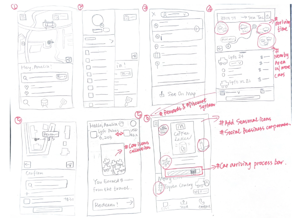
Before jumping into prototyping, I planned out several screens and layouts by sketching ideas on paper. After figuring out what belongs into every section, I began sketching icons and assets I needed to create for the prototype.