
Date:
October 1, 2023
Role:
UX Design, UX Research
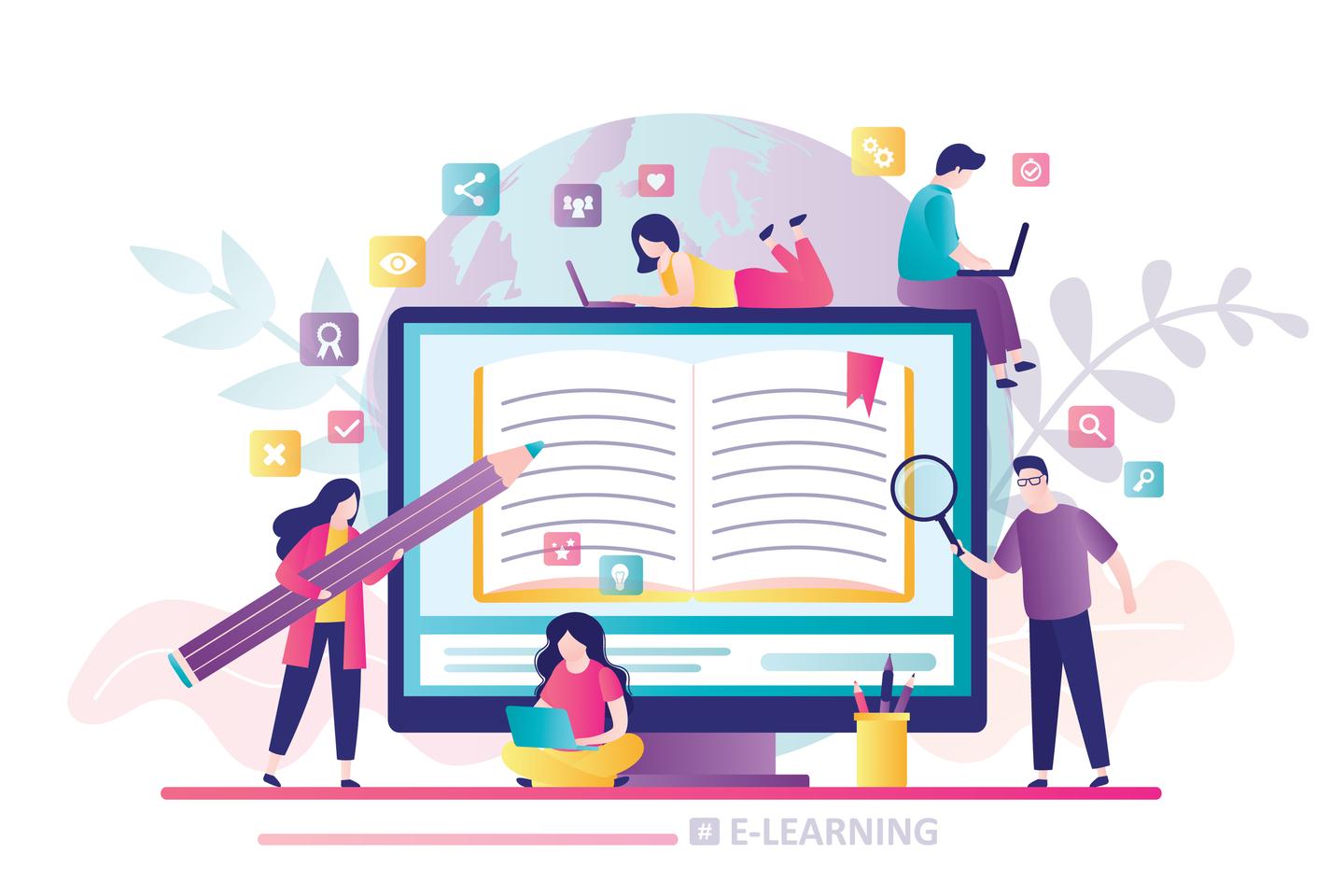
The AI Boot Camp Admin Portal addresses the diverse needs of course creators by providing a user-friendly platform for uploading and managing course content. Tailored for users with varying technical expertise, the portal streamlines the process of content creation, from visual layout to efficient uploading, offering a seamless experience for both novice and time-constrained creators.

Many course creators lack the technical know-how to effectively utilize tools for content creation and struggle with visual content formatting. Additionally, some creators face tight deadlines imposed by work or educational requirements, necessitating a solution that facilitates quick and hassle-free course uploads.

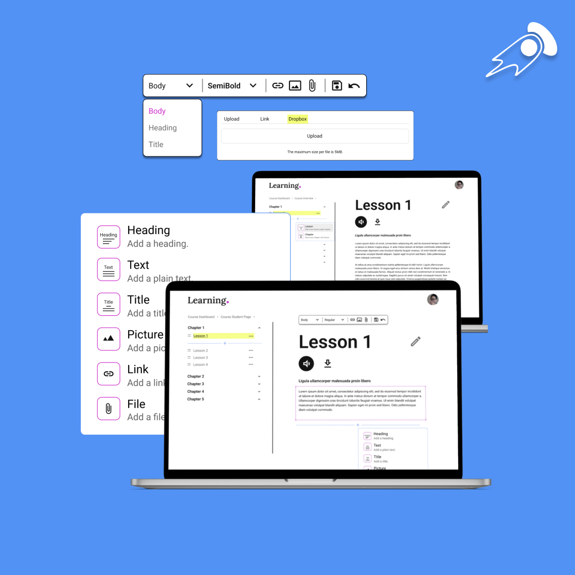
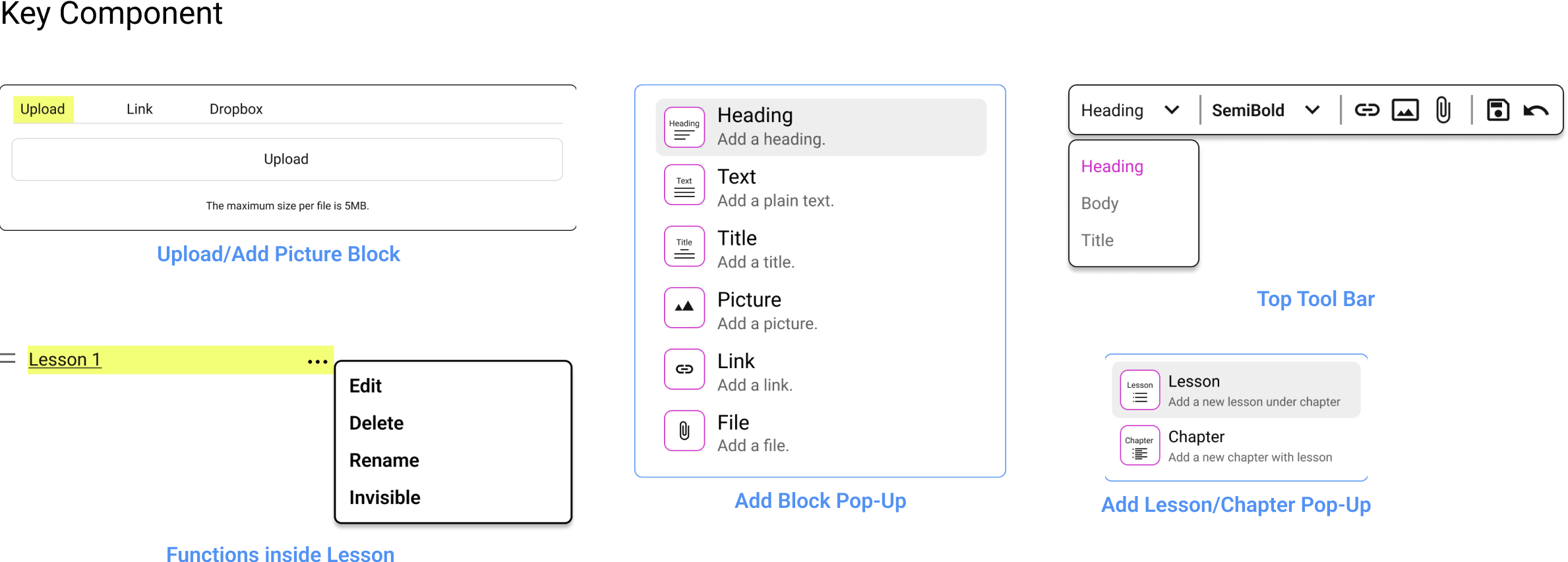
Snapbrillia is building a Admin Portal offers an intuitive interface, guiding users through the content upload process with ease. For those unfamiliar with visual formatting, built-in tools provide automated content layout options. Additionally, some time-constrained creators benefit from a streamlined and efficient process.
In the bustling success of Snapbrillia's AI Boot Camp, the unsung heroes behind the scenes are the course creators. Yet, the story often overlooks the challenges they face in seamlessly and accurately bringing the courses to the platform.
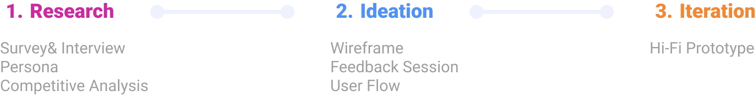
I sent out a survey to the registered users by emails and texts, and ask them if they are willing to take a user interview with incentives. We got more than 300 responses and around 50 people who are willing to do the interview online.

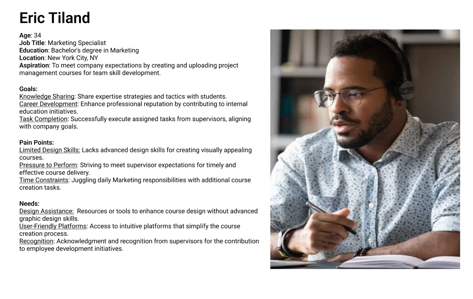
Encounter pressure to meet supervisor expectations emphasizes the need for tools and features that streamline the course creation process, allowing to create high-quality content efficiently.
Limited knowledge in e-learning platforms poses a significant barrier. Wish the platform prioritize simplicity and user-friendliness to accommodate users with varying technical backgrounds.

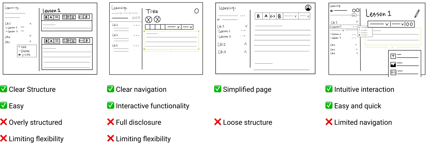
In order to determine which direction we go with, I held a feedback session with the product managers and other designers. We first reconfirm our goals for the on boarding tutorial:

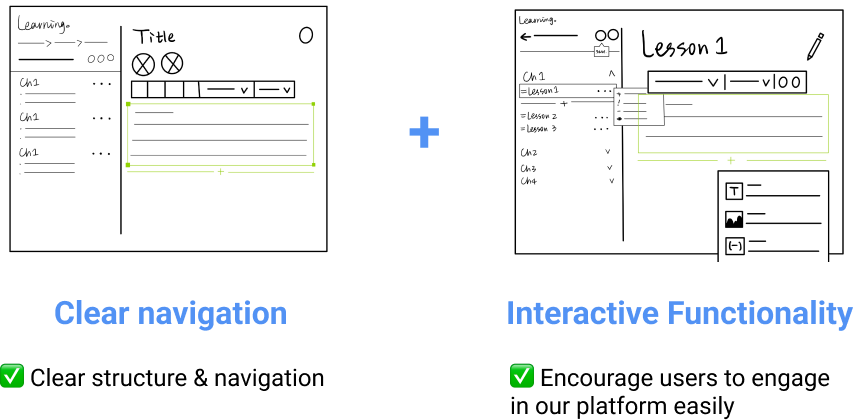
Therefore, we chose to combine the clear navigation and interactive functionality to achieve these goals.
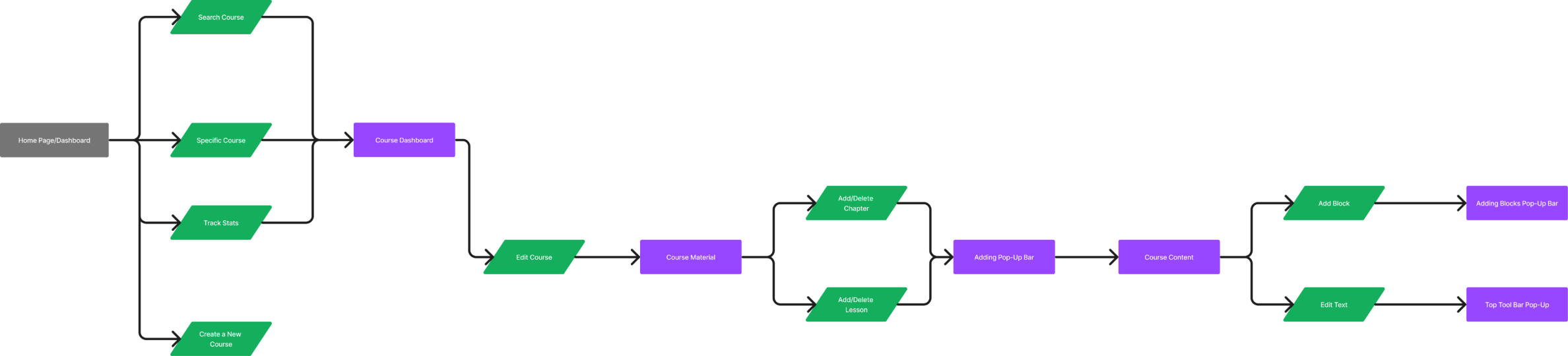
How users enter the admin portal and how explore to create/upload courses. Therefore, I needed to settle down 2 design challenges:
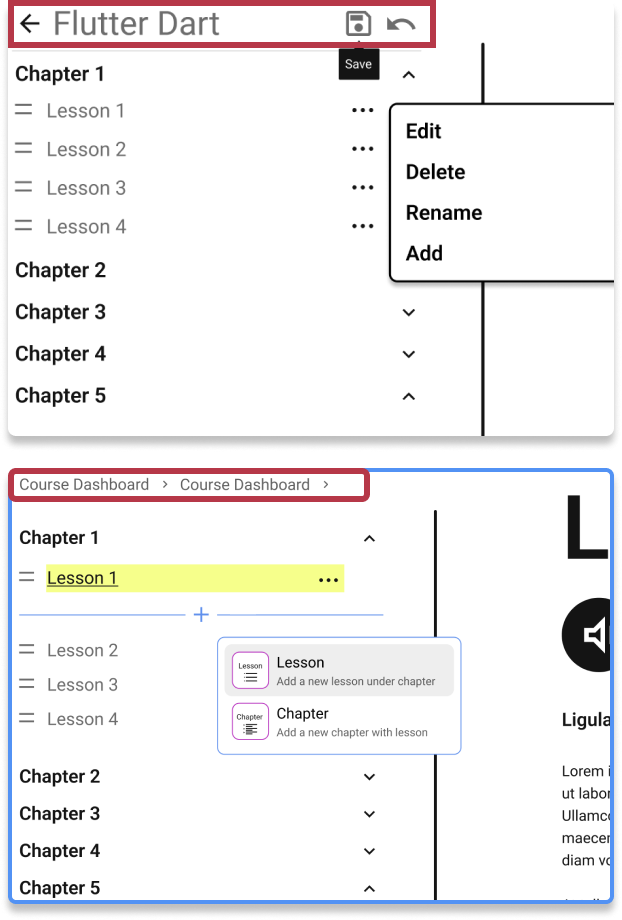
I chose the second one because:
The bread-crumb navigation allowing users to easily trace their steps. It reduces navigation complexity, helping users quickly understand their location within the site's hierarchy.
I chose Design Option 2, because:
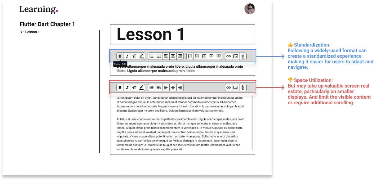
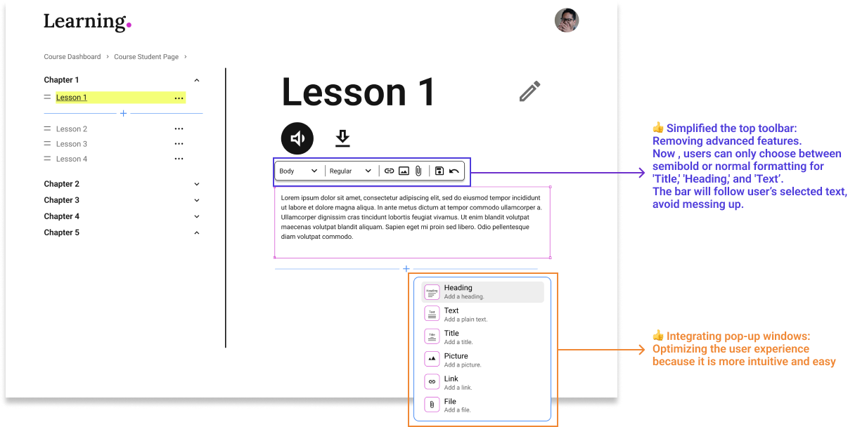
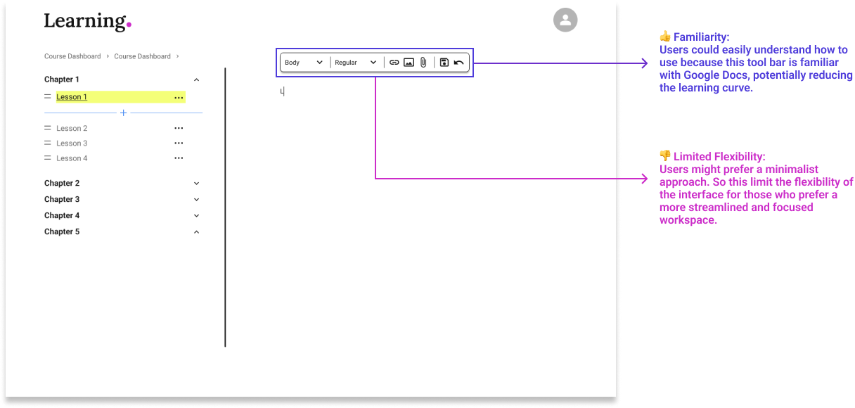
In the first phase of our project, our team has achieved a significant milestone by completing the initial design iteration. This collaborative effort has resulted in a visually compelling interface that aligns with our project goals. While we've successfully translated our ideas into design elements, we recognize the importance of user insights in refining and validating our work.
The next steps involve conducting another round of user interviews and usability tests, allowing us to gather valuable feedback and ensure that our design resonates effectively with our target audience. This iterative approach underscores our commitment to creating a user-centric and refined final product.
.png)